
BakerRipley Brand
CLIENT: BAKERRIPLEY
Texas’ oldest and largest traditional nonprofit came to us when they changed their name from Neighborhood Centers to the more distinctive BakerRipley. The only thing too precious to lose was their distinctive heart logo in its textural, irregular orange square.
As community developers advocating for change and improved communities, BakerRipley and its leadership were constantly communicating on behalf of the people they serve. I thought it valuable to orient the brand around words. I developed a system of textural, irregular rectangles with bright colors and photographs layered within that could be combined with type and portraiture to “build” sentences like BakerRipley builds communities.
Unlike most logos, which commonly require white space around them to stand out, the BakerRipley heart could be smushed right in with everything around it; a metaphor for the work done by BakerRipley in Houston and across the state to encourage growth, development and togetherness.
My role:
Collaborative concept, creative direction, design
Additional credits:
Produced while employed by The Black Sheep Agency

Distinctive business cards and an event flier show the flexibility of the new use styles for the logo.

BakerRipley ran the Hurricane Harvey refugee center in NRG Stadium (home of the Houston Texans) for several weeks, and volunteers wore the new branded t-shirts.

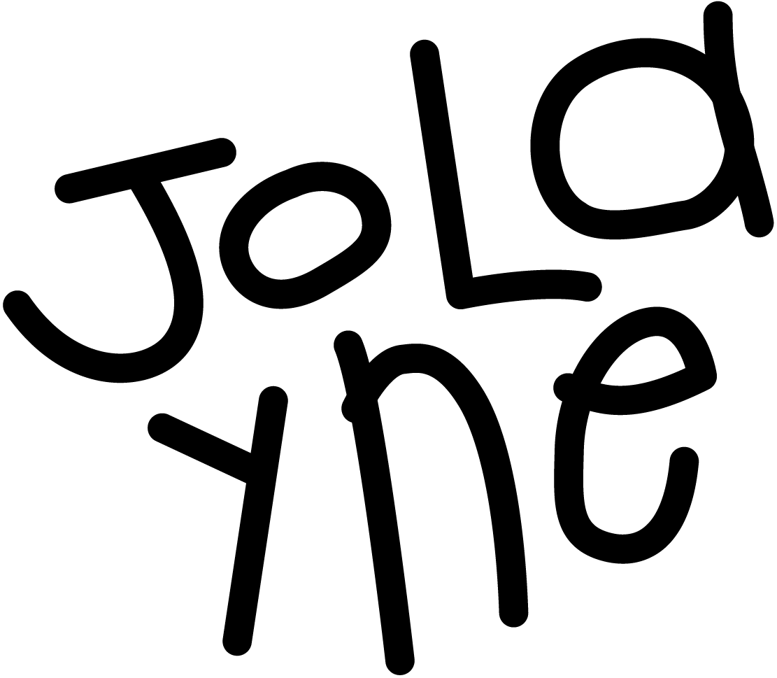
The brand embraced portraiture and other handmade graphic elements I generated with a brush and ink.

Called "Radically Human," the annual report for the year of the rebrand used lots of text as imagery and focused on the success stories of community members.

In this poster series, words and brush marks are used to build a skyline with clouds and even an "=" sign.

Multiple versions of the letterhead brought varying amounts of color, photography and text into play.

I defined the new color palette from BakerRipley's own community photography and on-campus paintings — but I kept their signature orange!

In this Twitter profile, you can see imagery in full color and as gradated backgrounds to the type.