


NightLight Brand
CLIENT: NIGHTLIGHT PEDIATRIC URGENT CARE
This pediatric urgent care clinic open nights and weekends came to us with a logo they liked and a brand they were ready to revamp. Their existing look was childish and colorful, but I reminded them that their audience was only children once families were in the door, and that up until then they were speaking to parents! We talked a lot about the differences between “childish” vs. “child-friendly.” We were shooting for the latter.
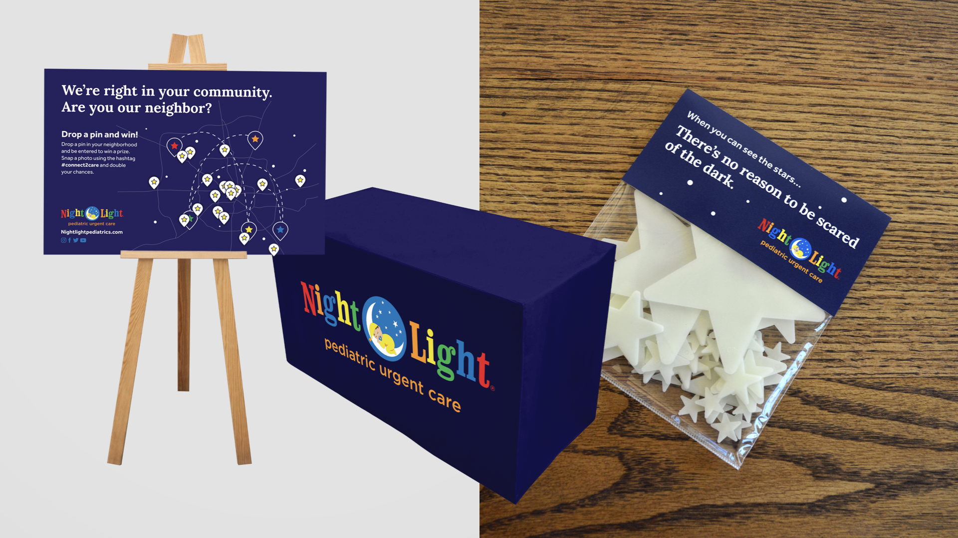
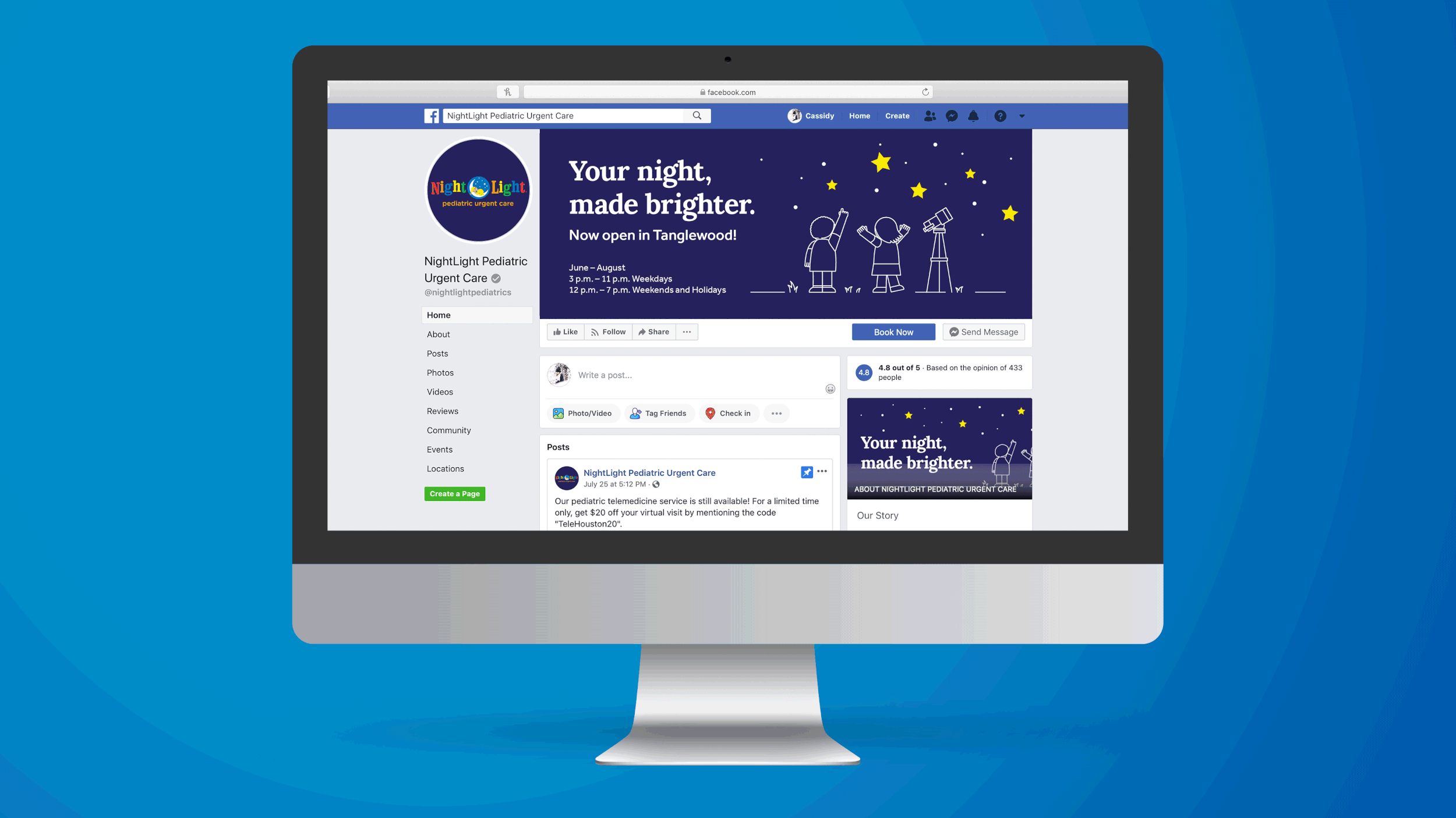
My creative concept for NightLight hinged on the idea of constellations, as they were expanding in the Houston area to create what we called “a constellation of care” complementary to the family’s regular pediatrician. We only lightly updated the logo, but introduced clean illustrations, glow-in-the-dark ink and a dark blue color (“midnight”) to balance and minimize the primary colors in the logo.
My favorite project for NightLight were their business cards, for which we created an assortment of faces, hairstyles and clothing employees could choose from to construct a “portrait” of themselves for their individual cards. Plentiful GIF animations, fun swag and IRL community engagement tactics really brought the brand to life.
My role:
Concept, creative direction, collaborative design
Additional credits:
Copywriting by Roslynn Velasquez
Design and illustration by Bill Ferenc
Produced while employed by The Black Sheep Agency